
具体描述
<>It is easy to create a bad looking chart in Excel. This book teaches you how to unlock the beautiful formatting options available to make incredible looking charts. The first section will talk about how to decide which chart type to use. Subsequent chapters will walk through each chart type, how to create them, how to utilize them, and special options available for each chart. The book discusses themes, colors, creating metallic charts, shadows, transparency, etc. The book also handles anything graphical in Excel. It will show the new In-Cell Data Bar charts available in Excel 2007. A section will talk about creating business flowcharts with IGX Graphics and how to display product pictures in Excel, and a section on VBA will cover creating 100's of charts using the macro language.
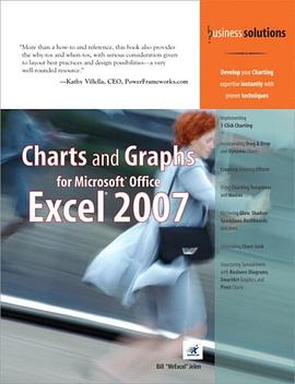
</p> <p style="margin: 0px;"> </p> <p style="margin: 0px;">“More than a how-to and reference, this book also provides the why-tos and when-tos, with serious consideration given to layout best practices and design possibilities–a very well-rounded resource.”</p> <p style="margin: 0px;">–Kathy Villella, CEO, PowerFrameworks.com</p>
<div style="margin: 0px;">Implementing 1-Click Charting
<div style="margin: 0px;">Incorporating Drag & Drop and Dynamic Charts
<div style="margin: 0px;">Creating Amazing Effects
<div style="margin: 0px;">Using Charting Templates and Macros
<div style="margin: 0px;">Mastering Glow, Shadow, Sparklines, Dashboards, and More
<div style="margin: 0px;">Eliminating Chart Junk
<div style="margin: 0px;">Structuring Spreadsheets with Business Diagrams, SmartArt Graphics, and Pivot Charts
<div style="margin: 0px;">Develop your Charting expertise instantly with proven techniques <p style="margin: 0px;">After 15 years with no updates to the Excel charting engine, Microsoft has provided a complete rewrite of the chart rendering engine in Excel 2007. However, no amount of soft glow or glass bevel effects will help you communicate your point if you use the wrong chart type. This book helps you choose the right charting type and shows you how to make it look great.</p> <p style="margin: 0px;"> </p> <p style="margin: 0px;">This book shows you how to coax Excel to create many charts you might not have believed were possible. You’ll learn techniques that allow you to ditch the Microsoft defaults and actually create charts that communicate your point. You’ll learn why the Excel stock charts are so restrictive and how you can easily turn any line chart into a stock chart–without any limitations. You’ll also learn how to add invisible series to make columns float in midair. Learn how to create charts right in Excel cells using the new Excel 2007 data bars–or even the decades-old REPT function!</p> <p style="margin: 0px;"> </p> <p style="margin: 0px;">In no time, this book will have you creating charts that wow your audience and effectively communicate your message.</p>
<div style="margin: 0px;">Master effective visual display of data
<div style="margin: 0px;">Choose the right chart type to convey your message
<div style="margin: 0px;">Learn time-saving workarounds
<div style="margin: 0px;">Create charts that most people think you can’t create with Excel
<div style="margin: 0px;">Understand what a Radar chart is and when you might use it
<div style="margin: 0px;">Summarize a million rows of data in a single pivot table chart
<div style="margin: 0px;">Present data graphically without charts
<div style="margin: 0px;">Employ SmartArt graphics to show process or relationship charts
<div style="margin: 0px;">Utilize VBA to create charts
<div style="margin: 0px;">Put your data on a map
<div style="margin: 0px;">Export your charts to the web or PowerPoint
<div style="margin: 0px;">Detect chart lies<p style="margin: 0px;">ABOUT THE AUTHOR</p> <p style="margin: 0px;">Bill Jelen is MrExcel! He is principal behind the leading Excel website, MrExcel.com. He honed his Excel wizardry during his 12-year tenure as a financial analyst for a fastgrowing public computer firm. Armed with only a spreadsheet, he learned how to turn thousands of rows of transactional data into meaningful summaries in record time. He is an accomplished author of books on Excel and is a regular guest on The Lab on TechTV Canada. You can find Bill at your local accounting group chapter meeting entertaining audiences with his humorous and informative Power Excel seminar. His website hosts more than 12 million page views annually.</p> <p style="margin: 0px;"> </p><p style="margin: 0px;">
</p> <p style="margin: 0px;"></p> <p style="margin: 0px;">Introduction
</p> <p style="margin: 0px;">1 Introducing Charts in Excel 2007
</p> <p style="margin: 0px;">2 Customizing Charts
</p> <p style="margin: 0px;">3 Creating Charts That Show Trends
</p> <p style="margin: 0px;">4 Creating Charts That Show Differences
</p> <p style="margin: 0px;">5 Creating Charts That Show Relationships
</p> <p style="margin: 0px;">6 Creating Stock Analysis Charts
</p> <p style="margin: 0px;">7 Advanced Chart Techniques
</p> <p style="margin: 0px;">8 Creating and Using Pivot Charts
</p> <p style="margin: 0px;">9 Presenting Data Visually Without Charts
</p> <p style="margin: 0px;">10 Presenting Your Excel Data on a Map Using Microsoft MapPoint
</p> <p style="margin: 0px;">11 Using SmartArt Graphics and Shapes
</p> <p style="margin: 0px;">12 Exporting Your Charts for Use Outside of Excel
</p> <p style="margin: 0px;">13 Using Excel VBA to Create Charts</p> <p style="margin: 0px;">14 Knowing When Someone Is Lying to You with a Chart
</p> <p style="margin: 0px;">Appendix A: Charting References
</p> <p style="margin: 0px;">Index</p> <p style="margin: 0px;"></p>
作者简介
目录信息
读后感
用户评价
从装帧的质感和纸张的选择来看,这本书似乎更倾向于一本可以长期放在办公桌上随时翻阅的参考手册,而非一次性读完的教程。我希望这本书不仅仅是停留在Excel 2007自带的标准图表功能上。在那个年代,许多高级可视化需求往往需要借助VBA宏或者外部插件才能实现。我非常好奇,作者是否在书中探讨了如何利用Excel的内置功能,在不依赖复杂编程的情况下,实现一些相对复杂的动态效果,比如响应用户选择的下拉菜单来实时刷新图表内容。如果它能介绍一些关于如何将制作好的图表导出并嵌入到PowerPoint演示文稿中,并且保持链接更新的技巧,那就太实用了。毕竟,图表最终的目的是为了沟通,如果导出后格式跑偏或者数据滞后,那所有的努力都白费了。我对它在“图表模板化”和“批量操作”方面的论述非常期待,这直接关系到我日常工作效率的提升。
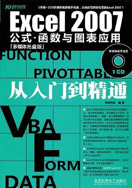
这本书的封面设计着实吸引人,那种沉稳的商务蓝和清晰的字体搭配,让人一眼就能感受到它专注于实用性的目的。我本来对Excel的数据可视化部分就感到有些吃力,尤其是在处理复杂的项目报告时,那些密密麻麻的数字总是让我无从下手。我期待这本书能像一个耐心的老前辈,一步一步地指导我,如何将那些枯燥的数据转化为一目了然的图表。我希望它不仅仅是停留在教你如何“点击”菜单栏里的某个按钮,而是能深入讲解每种图表背后的数据逻辑和适用场景。比如,当我们想展示不同时间段的市场份额变化时,是用折线图更合适,还是用面积图更能突出增长的趋势?这种深入的分析,我相信是区分一本优秀教材和普通操作指南的关键所在。此外,对于Office 2007这个版本,虽然现在看来有些年代感,但很多基础的图表制作原理是相通的,我更看重它在基础构建上的扎实程度,希望它能为我后续学习更新版本打下坚实的基础。从书名来看,它似乎直击要害,直奔“图表与图形”这个核心痛点,希望能真正解决我在工作中遇到的那些“图表难题”。
这本书的厚度让我感到既欣慰又略微不安——欣慰的是内容一定很详尽,不安的是它是否会陷入不必要的细节泥潭。我希望作者能掌握好理论深度与操作实用的平衡点。一个成功的图表教程,应该像一个精密的工具箱,里面放着针对不同“螺丝钉”的对应工具。我尤其关注它对“错误轴线标签”和“图例处理”这些容易让人抓狂的小细节的处理方式。在许多Excel教程中,这些细节常常被一带而过,结果就是图表在最后呈现时总有一两个地方显得业余。如果这本书能用清晰的截图和简洁的文字,帮我彻底解决这些“顽固”的格式问题,那绝对是物超所值。我期望这本书能教会我如何用图表建立起可靠的视觉叙事,让我的数据报告不再是信息的堆砌,而是具有说服力的商业论证。总而言之,我寻找的是一本能让我从“会用Excel做图”跨越到“做出专业、有效图表”的实战指南。
阅读这本书的目录时,我感受到了一种循序渐进的教学节奏,这对于我这种自学能力一般,更依赖清晰步骤指导的学习者来说至关重要。我对书中关于“数据选择与准备”的部分抱有极高的期望。众所周知,图表的好坏,百分之八十取决于你输入的数据是否“干净”。如果书中能提供一些关于如何清理和重构非结构化数据以便于图表生成的小窍门,那将是巨大的加分项。例如,如何处理缺失值,或者如何确保时间序列数据不会出现错位。另外,我对它介绍不同图表类型的覆盖面很感兴趣。除了常见的柱形图和饼图,我更关心那些用于展示关系、分布和构成的图表,比如散点图矩阵或者箱线图。在商业决策中,洞察数据背后的“为什么”比展示“是什么”更为重要,因此,如果这本书能引导我思考“我应该用什么图表来回答这个特定的业务问题”,而不是仅仅告诉我“点击此处生成这个图表”,那么它的价值将远远超出其售价。
这本书的排版和章节划分给我的第一印象是相当专业和严谨的。作为一名需要经常制作季度业务回顾的分析师,我的时间非常宝贵,我需要的不是冗长的理论铺陈,而是可以直接在工作中使用、能够快速检索的实战技巧。我特别留意了它在“自定义格式”和“高级美化”方面的着墨如何。很多时候,标准的Excel图表看起来过于呆板,无法在重要的董事会会议上留下深刻印象。我迫切希望书中能提供一些关于如何调整坐标轴精度、如何巧妙运用颜色序列来强调关键数据点,以及如何将多个数据系列整合到同一图表中的高级技巧。如果它能包含一些关于如何利用数据透视图(PivotChart)进行动态报告生成的讲解,那就更完美了。我宁愿花时间去学习一个能让我省下未来数小时重复劳动的复杂技巧,也不想浪费时间在那些幼儿园级别的“如何选中单元格”的步骤上。整体来看,这本书的结构似乎是为那些已经对Excel有基本操作能力,但渴望将图表制作提升到专业展示水平的用户量身定制的。