
具体描述
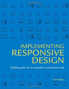
New devices and platforms emerge daily. Browsers iterate at a remarkable pace. Faced with this volatile landscape we can either struggle for control or we can embrace the inherent flexibility of the web. Responsive design is not just another technique-it is the beginning of the maturation of a medium and a fundamental shift in the way we think about the web. Implementing Responsive Design is a practical examination of how this fundamental shift affects the way we design and build our sites. Readers will learn how to: * Build responsive sites using a combination of fluid layouts, media queries, and fluid media * Adopt a responsive workflow from the very start of a project * Enhance content for different devices * Use feature-detection and server-side enhancement to provide a richer experience
作者简介
Tim Kadlec,是一位资深的Web开发者,也是Breaking Development联合创始人。Tim通过应用各类Web技术,满足了出版业、制造业、金融业等不同行业诸多用户对于跨设备完成各种规模任务的需求。 侯鸿儒,本科期间自学了HTML、CSS、JavaScript和PHP,在清华大学计算机系完成了有关HTML5应用的硕士毕业设计。之后又顺其自然地接触到了UI/UX,对响应式设计有着浓厚兴趣,并做过“Responsive Web Design & Workflow”的演讲。
目录信息
Where we went wrong . . . . . . . . . . . . . . . . . . . . . . . . . . . . . . . . . . . . . . . . . . . . . . . . . 3
The devices are coming, the devices are coming . . . . . . . . . . . . . . . . . . . . . . . . . 4
Display size ....................................................................... 6
Network speeds ................................................................... 6
Standards support ................................................................. 7
Input method ..................................................................... 7
Context .......................................................................... 8
Separate sites . . . . . . . . . . . . . . . . . . . . . . . . . . . . . . . . . . . . . . . . . . . . . . . . . . . . . . . . . 9
Divergence ......................................................................10
Becoming responsive . . . . . . . . . . . . . . . . . . . . . . . . . . . . . . . . . . . . . . . . . . . . . . . . . 11
Progressive enhancement .........................................................14
Why another book on responsive design? . . . . . . . . . . . . . . . . . . . . . . . . . . . . . . 16
What’s covered? . . . . . . . . . . . . . . . . . . . . . . . . . . . . . . . . . . . . . . . . . . . . . . . . . . . . . . 17
Who is this book for? . . . . . . . . . . . . . . . . . . . . . . . . . . . . . . . . . . . . . . . . . . . . . . . . . 18
Code examples . . . . . . . . . . . . . . . . . . . . . . . . . . . . . . . . . . . . . . . . . . . . . . . . . . . . . . . 19
The companion site . . . . . . . . . . . . . . . . . . . . . . . . . . . . . . . . . . . . . . . . . . . . . . . . . . 19
Chapter 2: fluID layouts 21
Layout options . . . . . . . . . . . . . . . . . . . . . . . . . . . . . . . . . . . . . . . . . . . . . . . . . . . . . . . 23
Fixed-width .....................................................................23
Fluid layouts .....................................................................25
Elastic layouts ...................................................................26
Hybrid layouts ...................................................................26
Which approach is the most responsive? ...........................................27
Sizing fonts . . . . . . . . . . . . . . . . . . . . . . . . . . . . . . . . . . . . . . . . . . . . . . . . . . . . . . . . . . 28
Pixels ...........................................................................28
Ems .............................................................................29
Percentages ......................................................................31
Bonus round: rems ...............................................................32
Which approach is the most responsive? ...........................................33
Converting from pixels ...........................................................34
x ImplemenTIng ResponsIve DesIgnGrid layouts . . . . . . . . . . . . . . . . . . . . . . . . . . . . . . . . . . . . . . . . . . . . . . . . . . . . . . . . . 36
Content-out .....................................................................37
Setting the grid ..................................................................38
Mixing fixed and fluid widths . . . . . . . . . . . . . . . . . . . . . . . . . . . . . . . . . . . . . . . . . 44
Table layouts—the right way ......................................................44
Wrapping it up . . . . . . . . . . . . . . . . . . . . . . . . . . . . . . . . . . . . . . . . . . . . . . . . . . . . . . . 50
Chapter 3: meDIa QueRIes 53
Viewports . . . . . . . . . . . . . . . . . . . . . . . . . . . . . . . . . . . . . . . . . . . . . . . . . . . . . . . . . . . 57
A pixel is a pixel, unless it isn’t .....................................................58
Viewport tag and properties ......................................................59
Media query structure . . . . . . . . . . . . . . . . . . . . . . . . . . . . . . . . . . . . . . . . . . . . . . . . 65
Media types .....................................................................65
Media expressions ...............................................................67
Logical keywords ................................................................67
Rules ............................................................................72
Embedded versus external . . . . . . . . . . . . . . . . . . . . . . . . . . . . . . . . . . . . . . . . . . . . 73
Media query order . . . . . . . . . . . . . . . . . . . . . . . . . . . . . . . . . . . . . . . . . . . . . . . . . . . 74
Desktop down ...................................................................74
Mobile up .......................................................................75
Create your core experience . . . . . . . . . . . . . . . . . . . . . . . . . . . . . . . . . . . . . . . . . . 76
Determining breakpoints . . . . . . . . . . . . . . . . . . . . . . . . . . . . . . . . . . . . . . . . . . . . . 78
Follow the content ...............................................................79
Enhancing for larger screens ......................................................83
Using ems for more flexible media queries .........................................85
Navigation . . . . . . . . . . . . . . . . . . . . . . . . . . . . . . . . . . . . . . . . . . . . . . . . . . . . . . . . . . . 87
Toggling .........................................................................88
Supporting Internet Explorer . . . . . . . . . . . . . . . . . . . . . . . . . . . . . . . . . . . . . . . . . 92
Wrapping it up . . . . . . . . . . . . . . . . . . . . . . . . . . . . . . . . . . . . . . . . . . . . . . . . . . . . . . . 93
Chapter 4: ResponsIve meDIa 95
What’s the problem? . . . . . . . . . . . . . . . . . . . . . . . . . . . . . . . . . . . . . . . . . . . . . . . . . 96
Performance .....................................................................97
Selectively serving images to mobile . . . . . . . . . . . . . . . . . . . . . . . . . . . . . . . . . . . 99
JavaScript ......................................................................100
conTenTs xiIntroducing matchMedia ........................................................104
Responsive image strategies . . . . . . . . . . . . . . . . . . . . . . . . . . . . . . . . . . . . . . . . . 105
Fighting the browser ............................................................105
Resignation .....................................................................106
Going to the server ..............................................................106
Responsive image options . . . . . . . . . . . . . . . . . . . . . . . . . . . . . . . . . . . . . . . . . . . 106
Sencha.io Src ...................................................................106
Adaptive Images ................................................................107
Wait, what’s the answer here? ....................................................111
Background images . . . . . . . . . . . . . . . . . . . . . . . . . . . . . . . . . . . . . . . . . . . . . . . . . 111
While we’re at it .................................................................113
High-resolution displays . . . . . . . . . . . . . . . . . . . . . . . . . . . . . . . . . . . . . . . . . . . . . 115
SVG ...........................................................................116
Other fixed-width assets . . . . . . . . . . . . . . . . . . . . . . . . . . . . . . . . . . . . . . . . . . . . . 118
Video ..........................................................................118
Advertising .....................................................................122
Wrapping it up . . . . . . . . . . . . . . . . . . . . . . . . . . . . . . . . . . . . . . . . . . . . . . . . . . . . . . 125
Chapter 5: plannIng 127
Choosing to be responsive . . . . . . . . . . . . . . . . . . . . . . . . . . . . . . . . . . . . . . . . . . . 128
Considerations . . . . . . . . . . . . . . . . . . . . . . . . . . . . . . . . . . . . . . . . . . . . . . . . . . . . . 129
Performance ....................................................................129
Context ........................................................................130
Content negotiation .............................................................130
Time investment ................................................................130
Support ........................................................................131
Advertising .....................................................................132
Conclusion .....................................................................132
Consider your analytics . . . . . . . . . . . . . . . . . . . . . . . . . . . . . . . . . . . . . . . . . . . . . 133
Skewed site analytics ............................................................134
Which stats matter ..............................................................135
Skewed market share statistics ...................................................139
Consider your content . . . . . . . . . . . . . . . . . . . . . . . . . . . . . . . . . . . . . . . . . . . . . . . 139
Content audit ...................................................................140
Page tables .....................................................................143
xii ImplemenTIng ResponsIve DesIgnConsider where you’re going . . . . . . . . . . . . . . . . . . . . . . . . . . . . . . . . . . . . . . . . . 144
Optimized for some, accessible to many ..........................................144
Consider the cross-device experience . . . . . . . . . . . . . . . . . . . . . . . . . . . . . . . . . 145
Prepare your test bed . . . . . . . . . . . . . . . . . . . . . . . . . . . . . . . . . . . . . . . . . . . . . . . . 147
Actual devices ..................................................................148
Emulators ......................................................................150
Third-party services .............................................................152
Wrapping it up . . . . . . . . . . . . . . . . . . . . . . . . . . . . . . . . . . . . . . . . . . . . . . . . . . . . . . 152
Chapter 6: DesIgn woRkflow 153
Your mileage may vary . . . . . . . . . . . . . . . . . . . . . . . . . . . . . . . . . . . . . . . . . . . . . . . 154
An interactive medium ..........................................................155
Collaboration ...................................................................155
Thinking in systems .............................................................160
Thinking mobile first . . . . . . . . . . . . . . . . . . . . . . . . . . . . . . . . . . . . . . . . . . . . . . . . 160
Mobile is exploding .............................................................161
Mobile forces you to focus .......................................................162
Mobile extends your capabilities .................................................164
The tools . . . . . . . . . . . . . . . . . . . . . . . . . . . . . . . . . . . . . . . . . . . . . . . . . . . . . . . . . . . 165
Wireframes .....................................................................165
Mock-ups ......................................................................168
Style guides ....................................................................173
Wrapping it up . . . . . . . . . . . . . . . . . . . . . . . . . . . . . . . . . . . . . . . . . . . . . . . . . . . . . . 178
Chapter 7: ResponsIve content 179
Starting with the content . . . . . . . . . . . . . . . . . . . . . . . . . . . . . . . . . . . . . . . . . . . . 180
Content types . . . . . . . . . . . . . . . . . . . . . . . . . . . . . . . . . . . . . . . . . . . . . . . . . . . . . . 181
Purpose ........................................................................182
Creation. . . . . . . . . . . . . . . . . . . . . . . . . . . . . . . . . . . . . . . . . . . . . . . . . . . . . . . . . . . . . . . . . . . . . . . .182
Structure .......................................................................182
What content to display, and when . . . . . . . . . . . . . . . . . . . . . . . . . . . . . . . . . . . 184
Removing content ..............................................................184
Enhancing content .............................................................186
When should content order change? . . . . . . . . . . . . . . . . . . . . . . . . . . . . . . . . . . 191
Structure, again .................................................................192
conTenTs xiiiWhere we need to go . . . . . . . . . . . . . . . . . . . . . . . . . . . . . . . . . . . . . . . . . . . . . . . . 194
Code soup ......................................................................194
Baby steps ......................................................................195
Building an API .................................................................196
Wrapping it up . . . . . . . . . . . . . . . . . . . . . . . . . . . . . . . . . . . . . . . . . . . . . . . . . . . . . . 197
Chapter 8: Ress 199
User agent detection . . . . . . . . . . . . . . . . . . . . . . . . . . . . . . . . . . . . . . . . . . . . . . . . 201
Anatomy of a user agent string ...................................................202
What can you do with user agent detection? ......................................203
Feature detection . . . . . . . . . . . . . . . . . . . . . . . . . . . . . . . . . . . . . . . . . . . . . . . . . . . 204
Modernizr ......................................................................204
Going to the server ..............................................................205
Combining user agent detection and feature detection . . . . . . . . . . . . . . . . . 207
RESS: The best of both worlds . . . . . . . . . . . . . . . . . . . . . . . . . . . . . . . . . . . . . . . 208
Troubled waters . . . . . . . . . . . . . . . . . . . . . . . . . . . . . . . . . . . . . . . . . . . . . . . . . . . . . 209
Installing WURFL . . . . . . . . . . . . . . . . . . . . . . . . . . . . . . . . . . . . . . . . . . . . . . . . . . 213
Configuration ..................................................................214
Detecting capabilities . . . . . . . . . . . . . . . . . . . . . . . . . . . . . . . . . . . . . . . . . . . . . . . 216
Making calls ....................................................................221
Optimizing for touch ............................................................223
Wrapping it up . . . . . . . . . . . . . . . . . . . . . . . . . . . . . . . . . . . . . . . . . . . . . . . . . . . . . . 226
Chapter 9: ResponsIve expeRIences 227
A system of sensors . . . . . . . . . . . . . . . . . . . . . . . . . . . . . . . . . . . . . . . . . . . . . . . . . . 228
Network . . . . . . . . . . . . . . . . . . . . . . . . . . . . . . . . . . . . . . . . . . . . . . . . . . . . . . . . . . . . 230
What can we do? ................................................................231
Context . . . . . . . . . . . . . . . . . . . . . . . . . . . . . . . . . . . . . . . . . . . . . . . . . . . . . . . . . . . . 234
Classifying context ..............................................................236
Observe and research ...........................................................237
Capabilities . . . . . . . . . . . . . . . . . . . . . . . . . . . . . . . . . . . . . . . . . . . . . . . . . . . . . . . . . 238
HTML5 input types ............................................................238
APIs ...........................................................................241
Wrapping it up . . . . . . . . . . . . . . . . . . . . . . . . . . . . . . . . . . . . . . . . . . . . . . . . . . . . . . 253
xiv ImplemenTIng ResponsIve DesIgnChapter 10: lookIng foRwaRD 255
Photo Credits . . . . . . . . . . . . . . . . . . . . . . . . . . . . . . . . . . . . . . . . . . . . . . . . . . . . . . . 259
Index . . . . . . . . . . . . . . . . . . . . . . . . . . . . . . . . . . . . . . . . . . . . . . . . . . . . . . . . . . . . . . . 260
About the Technical Editor . . . . . . . . . . . . . . . . . . . . . . . . . . . . . . . . . . . . . . . . . . 271
About the Author . . . . . . . . . . . . . . . . . . . . . . . . . . . . . . . . . . . . . . . . . . . . . . . . . . . 271
· · · · · · (收起)
读后感
做responsive web design,如果需要看什么书籍的话,这一本就够了,其他的自己google上搜搜,在项目中积累问题的解决方法和经验,这样就够了。 这是一本很负责任的书,里面的旁白中有好的想法和插件的介绍,还有在线的sample供参考和练习,真的是一本不可多得的好书。 可以先...
好书,翻译简洁明了,很喜欢~《响应式Web设计实践》比《响应式Web设计:HTML5和CSS3实战》讲得更深入,但是作者已经默认读者懂得基础的HTML5和CSS3知识,而没有介绍例如<aside>、<section>、radius这些标签或者属性的意义。所以个人觉得这两本书能够很好的互补。
去年年中一次很偶然的机会,在微博里看到人民邮电出版社在寻人翻译这本《Implementing Responsive Design》。由于之前在百度实习时为项目组里做过相关的演讲,而且对RWD(Responsive Web Design)也很有兴趣,于是便有了自己翻译的第一本书——《响应式Web设计实践》。 在我看...
[《响应式Web设计实践》](http://book.douban.com/subject/21263576/)是一本关于响应式Web设计的书,虽然之前也有构建响应式站点的经验(比如[http://z.qzone.com](http://z.qzone.com))仔细读完全书,才知道响应式不只是media query这么简单。 本书内容非常丰富,下面介绍一...
好书,翻译简洁明了,很喜欢~《响应式Web设计实践》比《响应式Web设计:HTML5和CSS3实战》讲得更深入,但是作者已经默认读者懂得基础的HTML5和CSS3知识,而没有介绍例如<aside>、<section>、radius这些标签或者属性的意义。所以个人觉得这两本书能够很好的互补。
用户评价
作为一名经验丰富的 Web 前端工程师,我一直在寻找能够帮助我进一步精进响应式设计技能的书籍。《Implementing Responsive Design》无疑是近几年我看过的最令人振奋的一本书。它不仅仅是一本技术指南,更像是一次思维的启迪。作者并没有简单地罗列各种 CSS 属性和布局技巧,而是从宏观的角度,探讨了响应式设计的哲学和原则。我尤其赞赏书中对于“内容优先”设计的强调,以及如何通过巧妙的布局和排版,在不同屏幕尺寸下都能够清晰、有效地传达信息。书中对一些新兴的响应式技术,如容器查询(container queries)的讨论,也让我看到了响应式设计的未来发展方向。而且,它还深入探讨了如何进行响应式设计的前期规划和团队协作,这对于大型项目而言尤为重要。这本书帮助我打破了过去的一些固有思维模式,让我能够更灵活、更富有创造性地去解决响应式设计的挑战。
我带着相当高的期待入手了《Implementing Responsive Design》,毕竟响应式设计在当前 Web 开发领域的重要性不言而喻。这本书并没有让我失望,它以一种非常循序渐进的方式,带领读者深入理解响应式设计的方方面面。从最基础的 HTML 结构和 CSS 布局原则开始,逐步引申到更高级的概念,比如内容策略(content strategy)如何影响响应式布局,以及如何处理复杂的交互式组件。书中提供了大量的真实世界案例,让理论知识变得更加鲜活,我可以清晰地看到书中所讲的原理是如何在实际项目中应用的。我尤其欣赏作者在讲解如何进行性能优化时提出的见解,特别是针对图片和视频的响应式加载策略,这对于提升用户体验和降低带宽成本至关重要。此外,书中对于跨浏览器兼容性的处理也有深入的探讨,这一点对于保障网站的普遍可用性至关重要。总的来说,这本书为我提供了一个扎实的响应式设计知识体系,让我能够更自信、更有效地应对未来的 Web 开发挑战。
老实说,我一开始对《Implementing Responsive Design》并没有抱太大的期望,因为市面上关于响应式设计的书籍不少,但很多都比较浅显。然而,这本书的深度和广度着实让我眼前一亮。它并没有止步于讲解技术细节,而是更侧重于“为什么”和“如何更好地”去实现响应式设计。作者通过对用户体验、可访问性和搜索引擎优化的深入分析,阐释了响应式设计为何是现代 Web 开发不可或缺的一部分。书中关于响应式断点的选择,以及如何根据内容而非设备来决定布局的改变,这些观点给我留下了深刻的印象。它不仅仅是教你如何写代码,更是在培养你的设计思维和解决问题的能力。我特别喜欢书中关于渐进增强(progressive enhancement)和优雅降级(graceful degradation)的讨论,这对于构建健壮且面向未来的网站非常有启发。这本书让我对响应式设计的理解上升到了一个新的高度,从一个“能做”的层面,提升到了“做得好”的层面。
我一直对那些能够提供清晰、实用的解决方案,并且能帮助我提升工作效率的书籍情有独钟。《Implementing Responsive Design》完美地契合了我的需求。这本书将响应式设计的概念,从理论到实践,进行了一次非常全面的梳理。我特别喜欢它提供的那些详细的代码示例,不仅易于理解,而且可以直接应用于我的项目中。书中对于如何优化移动端性能的章节,给我提供了不少实用的技巧,比如如何利用懒加载(lazy loading)来提升页面加载速度,以及如何为不同设备提供不同尺寸的图片。此外,书中还涉及了如何进行响应式设计测试和调试,这对于确保网站在各种设备上的表现都达到预期至关重要。这本书让我对响应式设计的掌握更加得心应手,能够更快速、更准确地构建出优秀的响应式网页,这对于提升我的工作效率和项目质量都有着显著的帮助。
这本《Implementing Responsive Design》简直是一场及时雨,对于我这个一直纠结于如何在不同设备上保持网页美观和用户体验的开发者来说,简直是解救了我的困境。我之前尝试过很多零散的方法,看了不少博客文章,但总感觉碎片化,缺乏一个系统性的框架。这本书恰恰填补了我的这个空白。它不仅仅是讲解了媒体查询(media queries)的用法,更深入地剖析了响应式设计的核心理念,从移动优先(mobile-first)的策略,到弹性布局(flexbox)和网格布局(CSS Grid)的精妙运用,以及如何考虑图片和字体的自适应问题,都进行了详尽的阐述。我特别喜欢书中关于断点(breakpoints)选择的讨论,不再是凭感觉设置,而是有理论依据和实践指导。而且,它还触及到了性能优化方面,这对于移动端尤为重要。每当我遇到一些棘手的响应式布局问题时,都能在这本书中找到清晰的解答和实用的代码示例。它提供的解决方案不仅技术上可行,而且考虑到了可维护性和可扩展性,让我受益匪浅。我现在更有信心去构建能够适应各种屏幕尺寸的网站了,用户反馈也明显改善,这对我来说是最大的肯定。
The best programming book I've read this year. Three core concepts of web responsive design are elegantly explained, namely fluid layout, media query and responsive media, and most importantly, it's concisely written.
看了之后挺悲观的,或者是不被支持,或者是将被替代,当前页面和浏览器的各种标准确实还是挺坑人的。
在译
文字稍显晦涩。。。好多不认识的词。。。最后一个demo很fancy。。。
文字稍显晦涩。。。好多不认识的词。。。最后一个demo很fancy。。。